I started working for Control Concepts (CCI) in July of 2017. They do building automation for K-12, universities, pharmaceutical companies and other industries.
We use third party software called Niagara to create a front end for the customer allowing them to monitor and control all of the HVAC equipment throughout their building.
The default themes looked dated so I created custom jar files with eclipse allowing me to manipulate the CSS and improve the theme. I did not have complete freedom to redesign the interface due to the rigidity of the front end software and the cost of altering the existing UI design and associated assets.
I modified the CSS to achieve a more updated look in the navigation pane and framing.
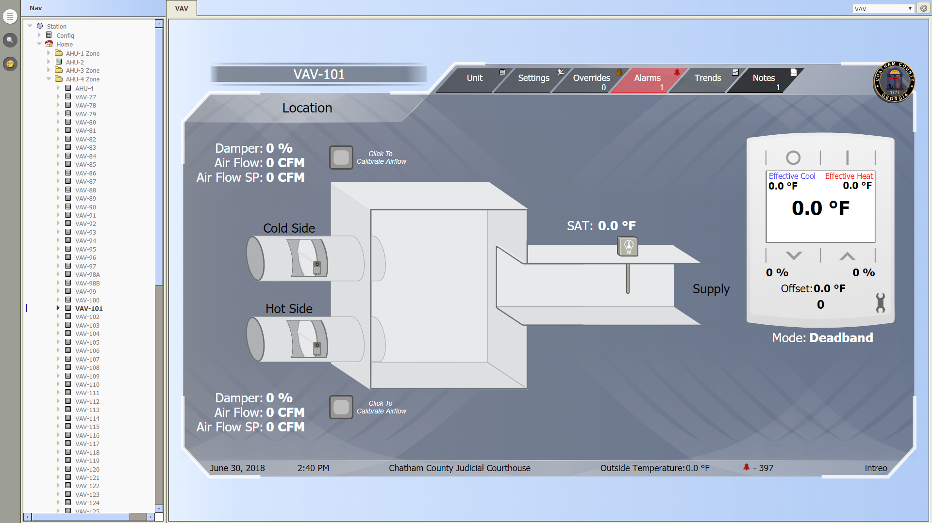
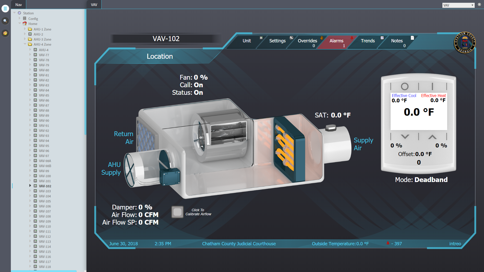
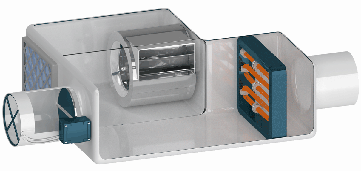
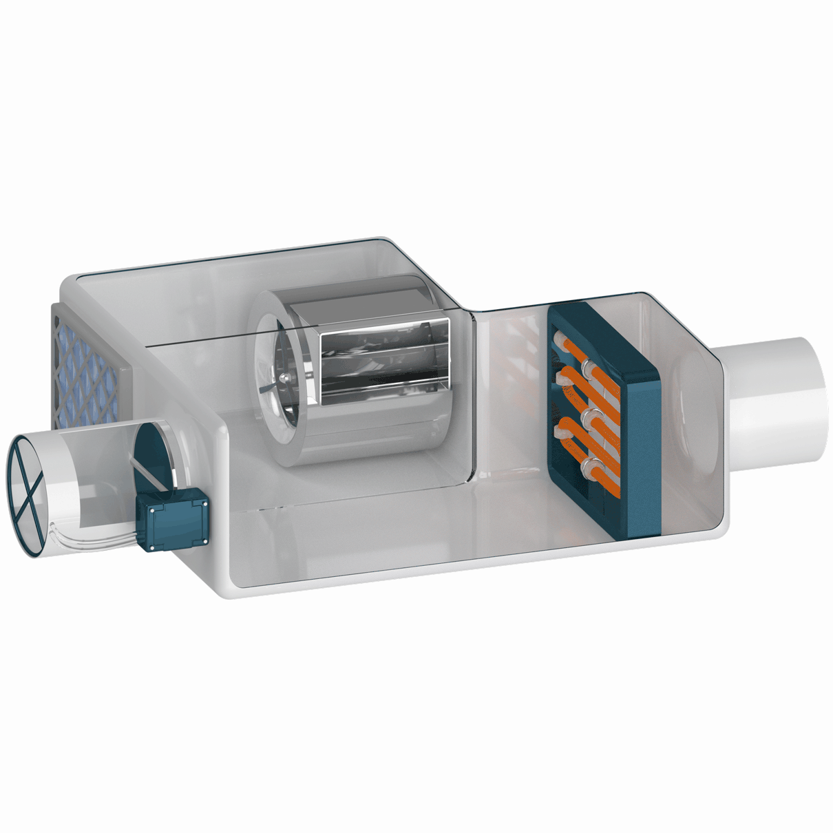
I used Blender to model and render custom graphics that I brought into Photoshop to create separate animated GIFs so that the different components can dynamically animate to mirror the state of the mechanical equipment.
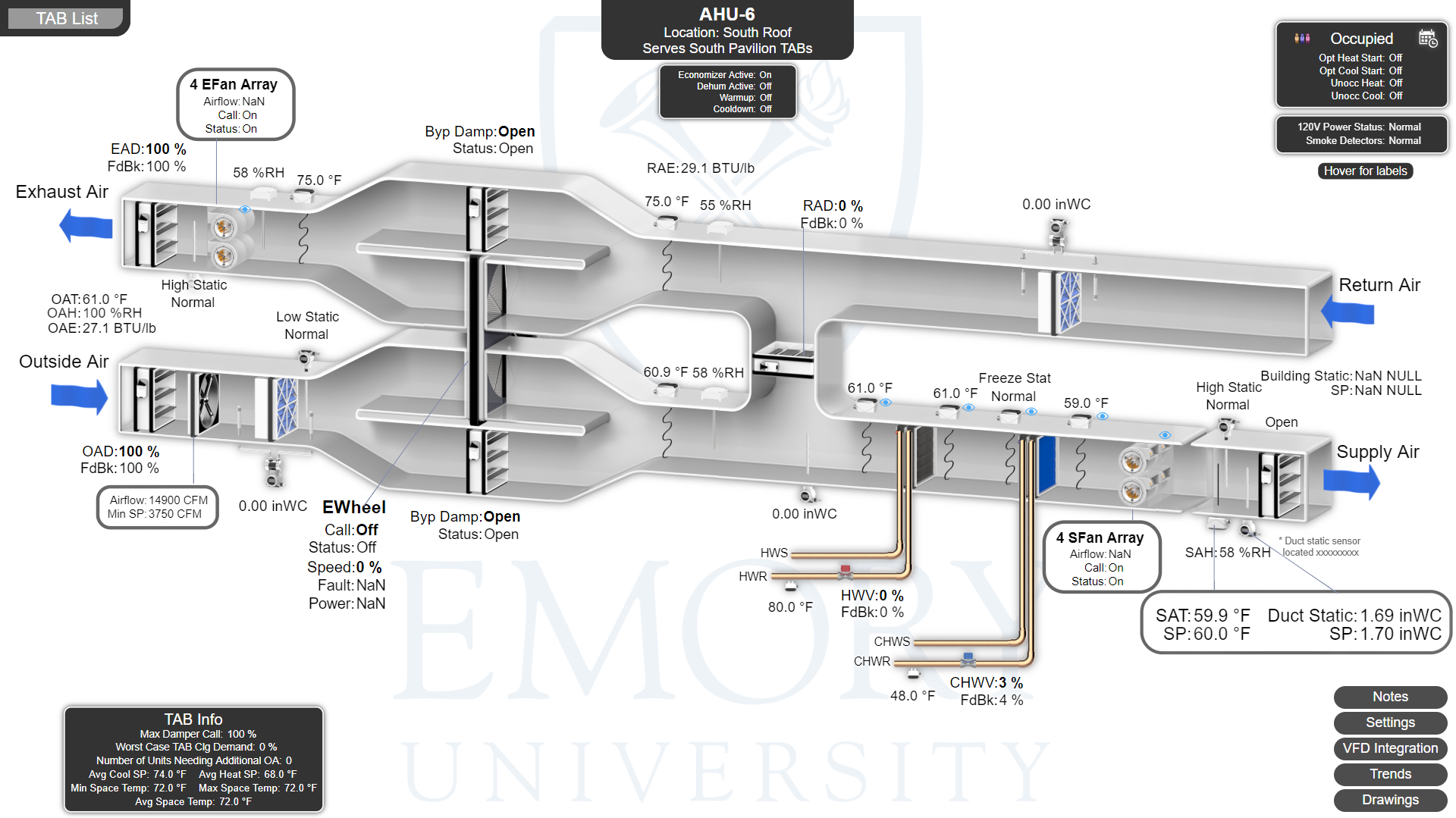
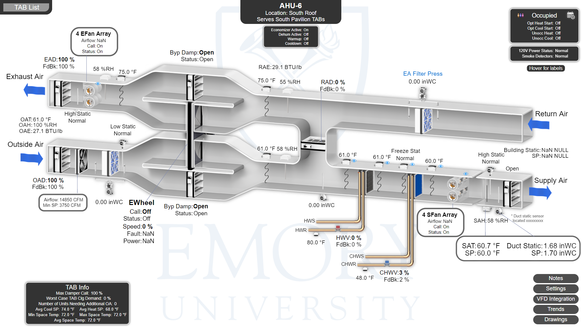
This is enteliWEB, it’s a different front end software that Control Concepts just started using. We have no pre-existing standards for these front ends so I am designing the navigation from scratch. The job I am working on is a new building for Emory University. I am working closely with the customer to tailor the interface to their specific needs.
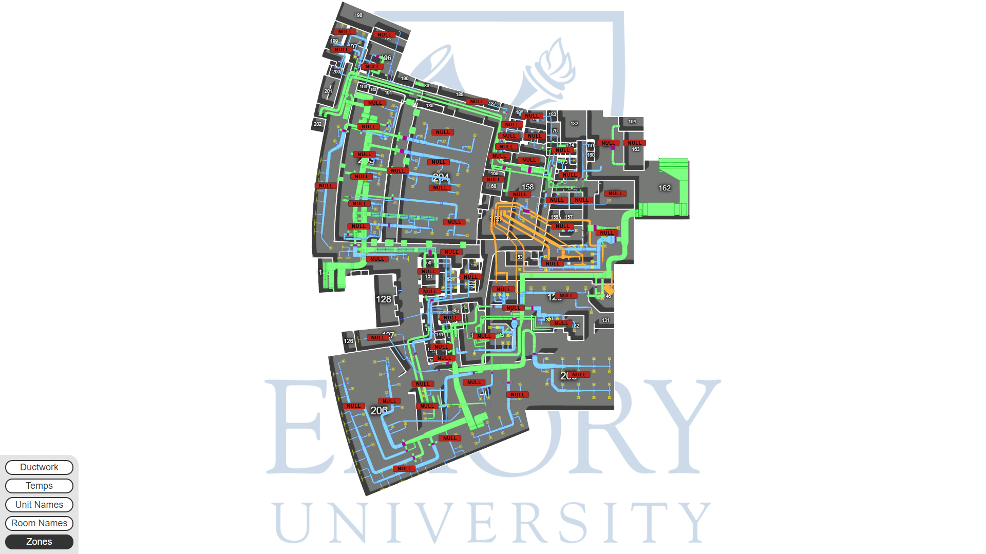
This is one of the floors of the building. It has separate layers for duct work, room numbers, zones, and space temperatures. The buttons in the bottom left corner allow the user to selectively display these layers depending on the information that is most important to them.`. The density of information on this page requires the user to have the ability to zoom and pan to navigate such large floor plans.
The air handlers for this building are especially complicated. It is necessary that all values related to the mechanical equipment be displayed allowing the user to monitor the operation and performance of the equipment and be alerted to failures.
The blue title seen in the top right corner of this page shows the function of hovering over any of the points to reveal a description of the value. This reduces the amount of information displayed at the same time in an effort to improve the user’s ability to absorb the relevant information. A button at the top right corner of the screen allows the user to make all the labels visible at once, if needed.